A big chunk of our work as software developers involves relying on literally decades of pre-existing domain knowledge gathered in giant programs that are considered so fundamental to our daily work that we never really think about them. Think HTML, text rendering, layout engines. We just need them to be available and we are all set.
As with most things in the world, 80-20 rule applies and can often be taken to the extreme. In my previous blog posts, I show that writing a proof-of-concept of a map engine or a layout algorithm can take as little as a couple hundred of JS code.
Today I will talk about text rendering. For the most part I managed to figure it out in the most basic cases, but in general it’s a massively complex problem and I will try to show the amount of compromises needed to get there.
Why would you want to do that?
Actually, it’s not that hard to find a legitimate reason: low-level graphics APIs don’t have built-in text rendering. All they do is render triangles. Of course, there are libraries that can do that for you, but those libraries do exactly the same things and have to go through roughly the same process as we will explore in this article.
Challenges
Ok, so what are the challenges that we need to overcome to render text on our own?
Learning about the font – reading TTF file
So we want to render some text on the screen. For that, we need to have a way to show individual glyphs and we need information on how to position them so that together they make words. To learn that, we need to parse the TTF file. There’s a great Microsoft OTF specification which applies to both OTF and TTF files. Following it we can extract information to know how far from the previous character and how far away from the next one each glyph wants to be.
I wrote about it a bit in 2019: TTF File Parsing.
But let’s quickly introduce the topic again. TTF file is a binary format for representing font files. Due to the binary nature, we need to heavily rely on documentation as the vast majority of the TTF file sections are not self-explanatory. They are just bytes and we have to know how to read them.
The file contains information about glyphs: what are their size, and how much space they would like to have around them. It has information about kerning – how pairs of characters should be spaced relative to each other. Ligatures – how to replace multiple characters with a single glyph. It of course has information on how to render each glyph – it defines vector paths. From more fundamental things: it has a table where it maps glyph IDs (which are just numbers, internal to the specific font) to the unicode code points that are useful to us. Standard defines dozens of so called tables that contain information about various aspects of the font.
Rasterizing glyphs
So we have a TTF file and we know how to extract spacing and sizing information from it. But we are still missing the way to draw the glyph itself. We could extract vector shapes data from the TTF file and rasterize glyphs ourselves but there are other (way easier) methods for that.
This is a part where I am giving up on reinventing the wheel and just using browser <canvas> API to draw the glyphs for me as part of the process. Other popular in gamedev community approach is to use FreeType or a native Windows or macOS APIs.
Drawing glyphs
Using <canvas> might have sounded like a solution, but keep in mind that we don’t really have a way to do that in WebGPU. Remember? Just triangles. So what are our options here?
We can again rasterize glyphs directly to a texture. We can pre-generate a texture, often called font atlas, and use that one to render.
Or, there’s a popular technique called SDF (Signed Distance Function) font rendering. Instead of storing bitmap pixels, each pixel represents distance from the edge of the glyph. Due to the nature of this method, rendering allows for using the same texture in multiple font sizes and rotations without quality loss, which would be a big problem in case of a bitmap font atlas.
The only catch is that all antialiasing is done by the programmer (by us!), without ability to rely on a high quality third party rasterizer. But results are usually quite decent (as we will see later). It’s not particularly helpful in implementation, but for its historic significance, it’s worth mentioning the original paper by Valve which presented the method.
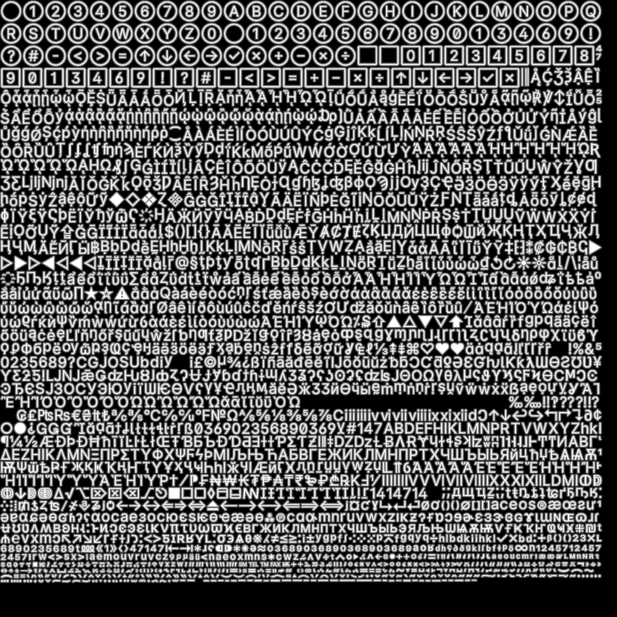
How many glyphs can we realistically fit in the texture?
Using 48px font size for glyphs in the atlas, I am able to render all 2.5k characters of Inter font. This sounds like a lot, but it’s only one font and one font weight. And it doesn’t support any alphabets other than latin and cyrillics (and some others that are based off latin). So handling more text variation would take a lot more texture space, possibly multiple textures with a need to switch between them.
You can have a look at Inter Lab and see how different font features affect rendering. Especially try turning kerning on and off as we will look into implementing it later!
What about… emojis?
So we store all needed characters in textures on the GPU. But what about emojis? There were 3,664 emojis in the standard in late 2021. There’s no easy way to allow for writing arbitrary emojis in arbitrary (reaching hundreds of px) size without dedicating insane (especially compared to basic ASCII or even extended ASCII alphabets) amounts of memory.
People have various solutions for that but for simplicity I won’t dive into this topic here. Sorry!
Text layout
Placing glyphs to form a word is one thing, but what about orchestrating the layout of whole paragraphs? While it begins rather easily with just keeping in mind when to break the line, it quickly escalates with various alphabets, mixing them, text direction, and emojis (again).
Check the wonderful article Text Rendering Hates You by Aria Beingessner to learn more about how immensely hard topic is coloring of text in some alphabets, positioning of glyphs in different scripts, rendering emoji and antialiasing text.
Action plan
Ok so given all those difficulties, what do we want to achieve to feel comfortable saying that we have solved text rendering?
Let’s settle for one font (Inter), with regular font weight and a basic text layout, where we tell the text box to wrap lines.
I have previously designed an API to do this for Red Otter. In retrospect, some choices I made there were not great and I am about to fix them. For example, TTF was a class, but it’s basically a one-time use object, so now it became parseTTF(buffer). Then, FontAtlas was responsible for both generating spacing information and rendering the texture. Now, the spacing calculations are lifted up to prepareLookups(ttf) function. Font, which was a class, also wasn’t particularly useful (and the name was too generic). Now it’s just shapeText(lookups, value, fontSize).
API
Let’s implement it. The whole implementation will be available below in the playground. In the article text I will show and explain just the most important parts.
parseTTF()
Parsing TTF is actually not as scary as I thought before I started doing it. It has an excellent specification (I used Microsoft OpenType Specification). There’s a pattern that I quickly started to see: TTF file consists of tables. The structure of any data, since it’s a binary file, follows the same pattern: there’s some kind of header or size information that tells how to process variable-sized lists. Sometimes there are offsets to other tables, which can be used to jump to them and then back.
I wrote a helper class BinaryReader which keeps a pointer to the current position in the buffer since reading TTF is mostly a stateful process.
prepareLookups()
The next step is extracting often-used information from the TTF file.
First thing, since we need to generate a font atlas texture and we need to store information about UV coordinates for rendering, I first begin with calculating the font atlas. calculateGlyphQuads() takes a TTF file and returns an array of Glyphs, which stores following information:
type Glyph = {
  /**
   * Unicode code point. Do not confuse with TTF glyph index.
   */
  id: number;
  character: string;
  x: number;
  y: number;
  width: number;
  height: number;
  /**
   * Left side bearing.
   */
  lsb: number;
  /**
   * Right side bearing.
   */
  rsb: number;
};
I have a helper function packShelves(), which uses a simple shelf-packing algorithm to fit rectangles. The most important output of the function is two maps: glyphs and uvs, which map glyphID to Glyph and glyphID to UV respectively. UV is a Vec4, where x and y are the top-left corner position and w, z are for size.
renderFontAtlas()
This function creates a <canvas> element and using information from the lookups, renders all glyphs to it. Since I am doing SDF rendering, I have a toSDF() function which processes the canvas to generate SDF texture.
shapeText()
Text shaping is a massive category of problems and I don’t have the ambition to do anything more than scratch the surface and pretend that everything else doesn’t exist.
In reality, there are huge libraries that have been in active development for decades. A notable example is HarfBuzz.
What is text shaping? To quote HarfBuzz documentation:
QUOTEText shaping is the process of translating a string of character codes (such as Unicode codepoints) into a properly arranged sequence of glyphs that can be rendered onto a screen […].
Inside of the shapeText() function:
let positionX = 0;
const scale = (1 / lookups.unitsPerEm) * fontSize;
const padding = (ATLAS_GAP * fontSize) / ATLAS_FONT_SIZE;

for (let i = 0; i < text.length; i++) {
  const character = text[i].charCodeAt(0);
  const glyph = lookups.glyphs.get(character);
  invariant(glyph, `Glyph not found for character ${text[i]}`);

  const { y, width, height, lsb, rsb } = glyph;

  positions.push(
    new Vec2(
      positionX + (lsb + kerning) * scale - padding,
      (lookups.capHeight - y - height) * scale - padding,
    ),
  );

  // 2 * padding is to account for padding from both sides of the
  // glyph.
  sizes.push(
    new Vec2(width * scale + padding * 2, height * scale + padding * 2),
  );
  positionX += (lsb + kerning + width + rsb) * scale;
}
drawText()
Actually, I did a simplification in the diagram and this is a whole Renderer class instead of a function. The reason is that I am using WebGPU, but in any kind of lower-level graphics API, there are so many things to set up and keep track of that it leads to simpler and better-organized code if it’s wrapped in a class.
I actually recently wrote an article about it – Thousands of Styled Rectangles in 120FPS on GPU so I will refer you to it for more details.
Some additions to the UIRenderer:
export class UIRenderer {
  // [...] Rest stays the same.
  setFont(lookups: Lookups, fontAtlasTexture: GPUTexture): void {}
  text(text: string, position: Vec2, fontSize: number, color: Vec4): void {}
}
setFont()creates a bind group with font atlas texture.text()callsshapeText()and writes to glyph data array.
Shader
The biggest trick to rendering SDF text is in the shader.
Let’s see how text shape with SDF texture looks like:
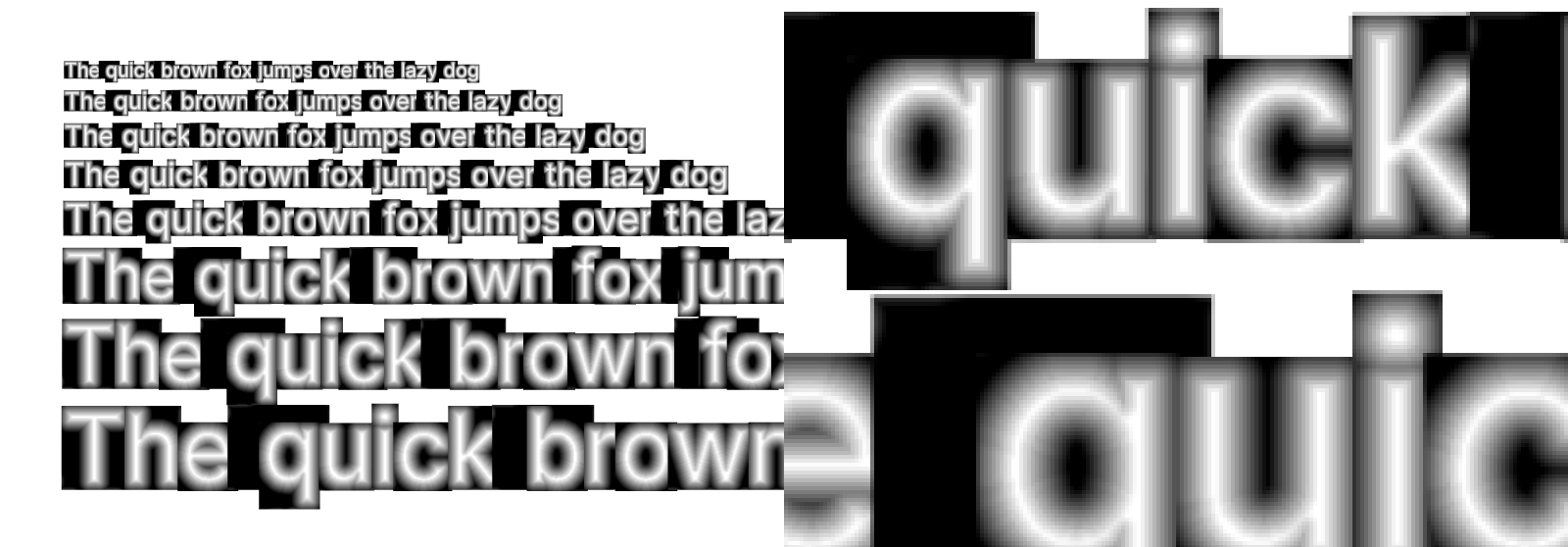
Now it’s very close. Just a matter of some math and we will be done. Here is the whole code:
struct VertexInput {
  @location(0) position: vec2f,
  @builtin(instance_index) instance: u32
};

struct VertexOutput {
  @builtin(position) position: vec4f,
  @location(1) @interpolate(flat) instance: u32,
  @location(2) @interpolate(linear) vertex: vec2f,
  @location(3) @interpolate(linear) uv: vec2f,
};

struct Glyph {
  position: vec2f,
  _unused: f32,
  fontSize: f32,
  color: vec4f,
  size: vec2f,
  uv: vec2f,
  uvSize: vec2f,
  window: vec2f,
};

struct GlyphData {
  glyphs: array<Glyph>,
};

@group(0) @binding(0) var<storage> text: GlyphData;
@group(0) @binding(1) var fontAtlasSampler: sampler;
@group(0) @binding(2) var fontAtlas: texture_2d<f32>;

@vertex
fn vertexMain(input: VertexInput) -> VertexOutput {
  var output: VertexOutput;
  let g = text.glyphs[input.instance];
  let vertex = mix(g.position.xy, g.position.xy + g.size, input.position);

  output.position = vec4f(vertex / g.window * 2 - 1, 0, 1);
  output.position.y = -output.position.y;
  output.vertex = vertex;
  output.uv = mix(g.uv, g.uv + g.uvSize, input.position);
  output.instance = input.instance;
  return output;
}

@fragment
fn fragmentMain(input: VertexOutput) -> @location(0) vec4f {
  let g = text.glyphs[input.instance];
  let distance = textureSample(fontAtlas, fontAtlasSampler, input.uv).a;

  var width = mix(0.4, 0.1, clamp(g.fontSize, 0, 40) / 40.0);
  width /= ${window.devicePixelRatio};
  let alpha = g.color.a * smoothstep(0.5 - width, 0.5 + width, distance);

  return vec4f(g.color.rgb, alpha);
}
There are a few tricks here specific to the renderer architecture:
- Rendering is based on instancing, which means that there’s one draw function call that renders multiple meshes, each having its instance index assigned in the vertex shader that can be used for accessing uniform or storage buffers. I need to pass the instance index to the fragment shader. I do that by writing it to
VertexOutputwith@interpolate(flat)attribute so that it comes as the exactu32value as it started. vertextakes input position (which is in NDC space[0, 1]) and transforms it to find position of the vertex in screen pixel space.uvis similarly calculated to find the correct UV coordinates which are some small portion of the[0, 1]range of the atlas.- I am flipping Y coordinate since UIs are usually rendered with Y axis pointing down, while in NDC space it’s pointing up.
The most important part is sampling the texture and calculating alpha. 0.5 is the border value. Anything lower than it is outside the glyph, anything above is inside. 0.5 is arbitrarily chosen, it can be anything as long as it matches how SDF texture is generated.
width is the width of the aliased border around the glyph. If set to 0, glyph will be perfectly sharp (and very jagged). If set too high, glyph will appear blurry.
let distance = textureSample(fontAtlas, fontAtlasSampler, input.uv).a;
var width = ???;
let alpha = g.color.a * smoothstep(0.5 - width, 0.5 + width, distance);

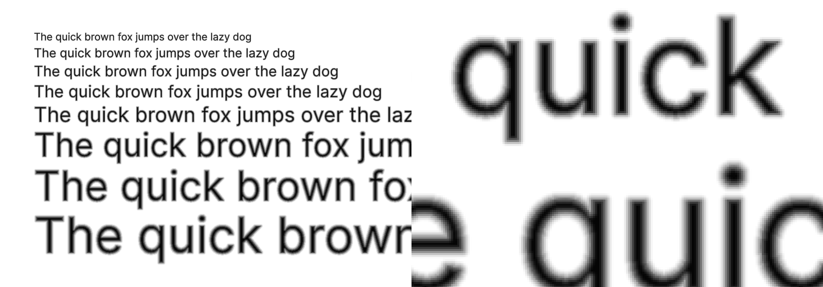
After tons of experimentation (and I’ve been playing with it for years!) I found out:
- As we can see from a simple experiment above, there’s no one-size-fits-all solution. It depends on the font size. For smaller sizes, we need to set
widthto a higher value, for larger sizes – lower. - Sampling nearby pixels and calculating a weighted average did not work great when I tried it. It adds blurriness but nothing that we couldn’t achieve with just regular methods and requires 4 additional texture samples per pixel.
- There’s probably no magic formula for perfect
widthvalue either. I have seen people do all kinds of crazy calculations, but they all are in the end as good as just eyeballing it. It’s also likely font-dependent. I found that0.4works nicely for small font sizes, and0.1is more or less the maximum for larger sizes. I also divide it bywindow.devicePixelRatioto reduce it on retina screens, since they need aliasing much less and otherwise text appears needlessly blurry. - There are of course way more advanced aliasing algorithms, but there are no low-hanging fruits here. Implementing something better would take way more work.

Quality
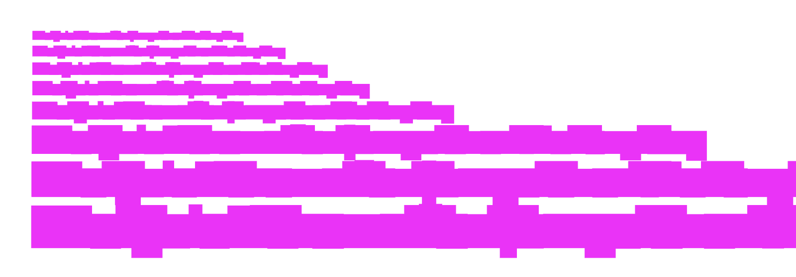
Quality of text depends a lot on the size of font atlas. If you would like the text to be sharper – give it more data to render from, which means – increase the size of the atlas. I found the text to be nicely sharper if I double the size of the atlas to 4096x4096px, which perfectly fits 96px font size.
Playground
Here’s the result of all this work:
Kerning
Although we have finished the basic text rendering and we are entering the territory of small adjustments and diminishing returns, there’s one very important thing that’s maybe not super easy to implement, but would make a huge difference for text appearance. It’s kerning.
Kerning defines how much space should be between two individual characters. It used to be defined in a table called kern, but as with many things regarding fonts – no one really thought about how widespread computers would become and how many alphabets and scripts they would need to support. This is why GPOS table in OTF came to life and it’s what I am going to use (since Inter uses that one).
How GPOS kerning works?
I don’t want to write entire sections to explain what’s going on there, so I will try to simplify as much as I can.
GPOS contains three lists: scripts, features, lookups. If font has kerning information stored in the GPOS table, one of the features will have a tag kern. That feature will have an index in the lookups table. That lookup will have a type. If it’s type number 2, it will contain glyph spacing info (there’s also type number 9, which is an extension and it basically says whichever previous type it actually is but with 32-bit indexing instead of 16-bit). For type 2, there are subtables and each of them will have a coverage table, that can come in two formats. Coverage table informs which glyphs are affected by the lookup (format 1 is a list of glyph IDs, format 2 is a list of ranges of those).
Then that lookup subtable also has a format. Format 1 is for glyph pairs. Format 2 is for glyph classes. For the first one, to look up kerning information we use coverage table to see if the first character of the pair is there, and then we use pair sets to find the second character and its kerning information. For the second subtable format we need to use a class definition table 1 to find out which class the first character belongs to, and analogously class definition 2 for the second character, and then class records to find out the final kerning information.
Sounds crazy and complicated and unfortunately it is. But good news is that it covers a decent chunk of the GPOS table, so if we ever want to add support for other alphabets that extensively use GPOS for character positioning, we will already have a bit of code written for that.
Implementation
A function for parsing GPOS table in a TTF file took me roughly 300 lines of code, not counting 3 helper functions and lots of type declarations. Therefore I will skip pasting it here (but it’s still available in playground in the end of the post!). All I can say is that it’s quite tedious work with Microsoft OpenType Specification open in one window and editor in another.
In the meantime I also started looking for other libraries implementing it. Surprisingly it wasn’t that easy to get a parsed TTF file with GPOS information included. I found that there’s an open PR to opentype.js: #557 which adds GPOS support. Looking at the final result helped me a lot when trying to understand the results I was getting.
When it comes to using the kerning information, it’s less code and more straightforward.
New lookups
Another interesting bit is the new lookups for checking if given pair of glyphs should be spaced anyhow differently.
There are two parts here: generating lookup info and the reading it.
For the lookup info, I went for creating a mapping of kerning pairs as a nested map where first character is a lookup for a map which might contain the other character.
const kerningPairs = new Map<number, Map<number, number>>();
let firstGlyphClassMapping = new Map<number, number>();
let secondGlyphClassMapping = new Map<number, number>();

let classRecords: {
  value1?: ValueRecord | undefined;
  value2?: ValueRecord | undefined;
}[][] = [];

const kern = ttf.GPOS?.features.find((f) => f.tag === "kern");
if (kern) {
  const lookups = kern.lookupListIndices.map((id) => ttf.GPOS?.lookups[id]);

  for (const lookup of lookups) {
    if (lookup && (lookup.lookupType === 2 || lookup.lookupType === 9)) {
      // Ensure it's Pair Adjustment
      for (const subtable of lookup.subtables) {
        if (lookup.lookupType === 9 && subtable.extensionLookupType === 2) {
          const coverage = subtable.extension.coverage;

          if (subtable.extension.posFormat === 1) {
            // Adjustment for glyph pairs.
            const pairSets = subtable.extension.pairSets;

            if (coverage.coverageFormat === 2) {
              let indexCounter = 0;
              for (const range of coverage.rangeRecords) {
                for (
                  let glyphID = range.startGlyphID;
                  glyphID <= range.endGlyphID;
                  glyphID++
                ) {
                  const pairs = pairSets[indexCounter];

                  const glyphKernMap =
                    kerningPairs.get(glyphID) || new Map<number, number>();
                  for (const pair of pairs) {
                    if (pair.value1?.xAdvance) {
                      glyphKernMap.set(
                        pair.secondGlyph,
                        pair.value1.xAdvance
                      );
                    }
                  }
                  if (glyphKernMap.size > 0) {
                    kerningPairs.set(glyphID, glyphKernMap);
                  }

                  indexCounter++;
                }
              }
            } else {
              console.warn(
                `Coverage format ${coverage.coverageFormat} is not supported.`
              );
            }
          } else if (subtable.extension.posFormat === 2) {
            // Adjustment for glyph classes.
            if (coverage.coverageFormat === 2) {
              const { classDef1, classDef2 } = subtable.extension;
              firstGlyphClassMapping = generateGlyphToClassMap(classDef1);
              secondGlyphClassMapping = generateGlyphToClassMap(classDef2);
              classRecords = subtable.extension.classRecords;
            } else {
              console.warn(
                `Coverage format ${coverage.coverageFormat} is not supported.`
              );
            }
          }
        }
      }
    }
  }
And the kern() function which is used in shapeText() to fetch kerning data:
function kern(firstCharacter: number, secondCharacter: number): number {
  const firstGlyphID = ttf.cmap.glyphIndexMap.get(firstCharacter);
  const secondGlyphID = ttf.cmap.glyphIndexMap.get(secondCharacter);
  invariant(firstGlyphID, `Glyph not found for: "${firstCharacter}"`);
  invariant(secondGlyphID, `Glyph not found for: "${secondCharacter}"`);

  const firstMap = kerningPairs.get(firstGlyphID);
  if (firstMap) {
    if (firstMap.get(secondGlyphID)) {
      return firstMap.get(secondGlyphID) ?? 0;
    }
  }

  // It's specified in the spec that if class is not defined for a
  // glyph, it
  // should be set to 0.
  const firstClass = firstGlyphClassMapping.get(firstGlyphID) ?? 0;
  const secondClass = secondGlyphClassMapping.get(secondGlyphID) ?? 0;

  const record = classRecords[firstClass][secondClass];
  return record.value1?.xAdvance ?? 0;

  return 0;
}
Text shaping adjustments
Inside the loop:
let kerning = 0;
if (ENABLE_KERNING && text[i - 1] && text[i]) {
  kerning = lookups.kern(text[i - 1].charCodeAt(0), text[i].charCodeAt(0));
}
Add kerning here:
new Vec2(
  positionX + (lsb + kerning) * scale - padding,
  (lookups.capHeight - y - height) * scale - padding,
);
And here:
positionX += (lsb + kerning + width + rsb) * scale;
Playground
And the result is here:
Summary
And we are done. We rendered good looking modern text font from scratch, using just the TTF font file as our input. Very ambitious goal, but it turns out it took only (?) around 2.6k LOC to get there. Of course, there’s a ton of things missing, but regardless, we really can render any English language text in a UI without having anything to be ashamed of.
So what is left?
Ligatures – it’s when multiple characters are combined to be represented by a special symbol. For example, fi is often replaced by a single glyph. However nice, ligatures are very delicate and for example many rendering engines switch them off if letter spacing changes (which makes sense – if fi were joined together because of how close they were, the reason is not there anymore if they are further apart). They also exist in form of contextual alternatives (calt). For example, font can define that whenever there are - > characters next to each other, they can be joined into →.
Emojis – quite a big topic. We would have to decide on a font to use for them, keeping in mind the license (most platform fonts such as Apple one are restricted so we wouldn’t be allowed to use it to generate a lookup texture that we would use everywhere). Then there’s also a matter of aliasing when scaling the bitmap emoji representations. And text processing becomes a lot more complicated since emojis can be defined by multiple unicode code points. And inserting them properly into text layout is also non-trivial. Plus as mentioned before, there are thousands of them and the same method with font atlas as we used wouldn’t work.
Text layout – so far we just rendered text in a straight line, but there’s much more to it. Aligning text to left/center/right, handling line breaks, deciding on how to break words. Allowing user to set available width of a text box vs allowing text to stretch without limits. Integrating text into a layout engine.
RTL, full GPOS and GSUB – we are entering the hardcore mode. Many alphabets are right-to-left. There are many alphabets, like arabic or vietnamese, that have contextual character placement. Something like kerning, but with much more complex rules and goes in any direction, not just horizontal. Same with ligatures that become not only a text decoration, but actual element needed to display text fully correct.